Survey Analytics – Distribution of Answers
The first analysis of the results of a customer satisfaction survey, customer experience or NPS is typically hierarchical or dimensional. This analysis involves analyzing the various questions and indicators of the survey to understand WHAT is working well and which aspects are considered good or bad.
If we have also included additional survey questions, following a similar strategy to that described in the article Improving on NPS Surveys, we can determine the WHY of the assessments obtained. Adding to the survey with extra questions will also help us to determine the priority of the dimensions or items with a decision-making chart like the ones described in the article Importance-Satisfaction Decision Charts .
Analysis of distribution
Another type of question to answer is WHERE things are happening. For example, for which sector or in which delegation is overall customer satisfaction greatest. This question may be asked about general satisfaction or the measurement of a particular dimension, such as “commercial aspects” or “aftersales service” or even an item of the survey.
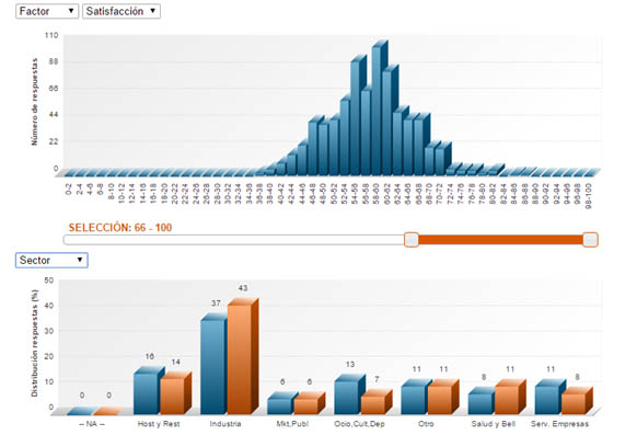
Distribution Analysis helps us to understand WHERE the WHATs of the previous paragraph are happening. For this analysis, we first need to select the range of scores that we want to analyze. In the chart below, it is the range of best scores (specifically the range of scores between 66 and 100).
Having selected the scores, we will see how they are distributed across the demographic variable we wish to study (in the figure in our example, Sector) in comparison to all survey answers.
Continuing with the chart in our example, we see that the ‘Industry’ sector has a high percentage of ‘highly satisfied’ customers compared to the percentage of customers who answered from this sector.
By comparing the distribution of the selection with all of the customers surveyed, we can identify the delegations, sectors, areas, etc. with a percentage of higher scores than the survey overall.
We can use this type of analysis to understand the distribution of our most satisfied customers, of our most dissatisfied customers or of our most ‘neutral’ ones, both generally and for any of the survey dimensions.
Distribution analysis + CRM
In the previous point, we suggested a classification of the most and least satisfied customers using the data we have available, which are the demographic variables included in the survey. This way, we are able to identify where things happen.
Distribution analysis is particularly useful when we have information on the people who answered the survey. This is done by linking the survey data with the company CRM and allows us to move from the previous WHERE to the WHO. This way, we can find out who are our most satisfied customers and who are the most dissatisfied ones – and hence, in the danger zone.
We can use this information to conduct specific sales campaigns for satisfied customers (perhaps promoters, in NPS terms) and others to try to avoid losing customers in the danger zone.
This article has outlined the benefits of distribution analysis. Firstly, it allows us to identify WHERE good and/or poor scores are given for the items/dimensions in our survey and, when combined with CRM data, it allows direct identification of WHO our satisfied/loyal/etc. customers are and which ones are in the danger zone, so that we can make the appropriate business or sales decisions for each case.
More information on Electronic Surveys.


